Unilabel
It is possible to display media content differently on the Moodle site, such as a carousel, a gallery, hidden/shown tabs, and an image board. Texts and links can also be added to resources inside and outside the course website.
1. Turn on Edit mode
3. Choose “Unilabel”.

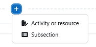
2. Select a topic, click on then select "Activity or resource".
4. Add a name to the resource, and if needed, a description in "Unilabel text".
5. Choose the type of label to display the content:


Accordion
Displays several elements one below the other as an accordion.
Carousel
Displays several texts as a carousel.
Collapsed Text
Displays a text as collapsed text. The title is used as a button to expand the text.
Grid
Displays visuals as a grid.
Imageboard
Displays different graphics on a canvas.
Label type: Accordion
1. Choose the "Accordion" label type, give it a name and a description.

2. Scroll down and click on "Save and edit content".

3. Type text in the "Unilabel text" to add stylized text above the accordion. To show it, tick next to "Show unilabel text".

Tick "Allow to open multiple..." to enable different segments of the accordion to be remain open at the same time.

4. To add segments, click on .

5. In the "Heading" field, enter the text that appears on the accordion segment. In "Content", add elements that are revealed once the segment is clicked.
6. Accordion segments can be re-ordered by holding on the icon and dragging the segment up or down. Segments can also be deleted by click on the icon.

Label type: Carousel

1. Choose the "Carousel" label type, give it a name and a description.

2. Scroll down and click on "Save and edit content".
3. Type text in the "Unilabel text" to add stylized text above the carousel. To show it, tick next to "Show unilabel text".
4. Under the "Carousel" tab, choose how the carousel will behave and what it will look like:


5. To add slides, click on .
6. Each slide can be edited and modified by clicking on the numbered tab.
The caption that appears under the image
The URL of the website students will be taken to when clicking on the image or text.
The text that appears when hovering over the image
The image that appears in the slide
A smaller version of the image that will appear when Moodle is accessed through a mobile browser.
7. Carousel slides can be re-ordered by holding on the icon and dragging the slide up or down. Slides can also be deleted by clicking on the icon.

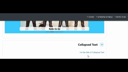
Label type: Collapsed Text
1. Choose the "Collapsed text" label type, give it a name and a description.

2. Scroll down and click on "Save and edit content".

3. Type text in the "Unilabel text" to add the content that will be revealed when clicking on the text.

4. In the "Collapsed text" tab, type in "Title" the text that is to be clicked on to reveal more content.
5. The type of "Presentation" can also be changed from "Collapsed" to "Modal dialogue", which reveals the text in a full-screen window:

Unchecking this option will remove the reveal/fade effect, and instead the collapsed text will simply appear.
Label type: Grid


1. Choose the "Grid" label type, give it a name and a description.
2. Scroll down and click on "Save and edit content".
4. In the "Grid" tab, enter the grid's number of columns and height. It is also possible to choose how the grid appears on smaller or mobile screens.
3. Type text in the "Unilabel text" to add stylized text above the carousel. To show it, tick next to "Show unilabel text".

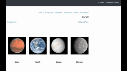
7. Grid tiles can be re-ordered by holding on the icon and dragging the slide up or down. Tiles can also be deleted by clicking on the icon.

6. Each tile can be edited and modified by clicking on the numbered tab.
The title that appears below the image.
The image that appears in the grid
If content is added, it will be displayed in an overlay window. However, if a URL is inserted, the content will not be shown; instead, the link will be opened.
A smaller version of the image that will appear when Moodle is accessed through a mobile browser.


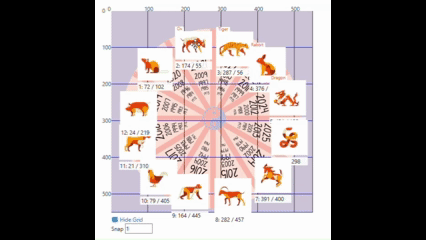
Label type: Imageboard
1. Choose the "Imageboard" label type, give it a name and a description.

2. Scroll down and click on "Save and edit content".
3. Type text in the "Unilabel text" to add stylized text above the imageboard. To show it, tick next to "Show unilabel text".
4. First, choose the settings for the background canvas on which the other graphic will be displayed:
The canvas' width and height
Auto-scaling the canvas will use the maximum width in the course page.
Note: If unticked, the canvas might be cut off to fit the course page.
The background image for the imageboard
The title that is displayed next to each graphic:
-
Its height
-
Its font size
-
Its font color
-
Its background color
Note: If using graphics with transparent backgrounds (PNG files), the background color must be white (#FFFFFe)
5. To add images to the canvas, click on .
6. Each image can be edited and modified by clicking on the numbered tab.
The title that appears above the image. If none is entered, there will be no title.
The URL of the website students will be taken to when clicking on the image
The placement of the image on the canvas. It can be changed by dragging the image around the canvas, or by manually inputting the coordinates.
The image that appears on the canvas
The width/height of the image, its border and the border's radius
7. The images can be dragged around the canvas.
Note: The image coordinates on the canvas change as the image is moved.